
I don’t need a designer, I can do it myself
- by merylpixelmagic
- posted May 14, 2009
I got a call from a friend the other day – she works for her mom occasionally, and her mom wanted her to redo the company business cards for their boss, but she didn’t have the right programs to do it in. Her mom wanted her to use Powerpoint, because why should she pay a designer when she knew exactly what she wanted?
I laughed. I couldn’t help myself 😉
For those of you who don’t know why that’s funny, let me explain:
When you are designing for print (like business cards, as opposed to screen, ie: for websites or PowerPoint presentations) there are a few things you have to bear in mind:
1. The image you create has to be 300dpi
dpi refers to dots per inch: literally the number of dots of ink that a printer needs to place on an inch of paper when printing. Standard dpi resolution for things like business cards is 300dpi … standard for screen like PowerPoint is 72dpi. (For a more in-depth explanation of dpi, see http://en.wikipedia.org/wiki/Dots_per_inch)
And here’s the kicker: Word and PowerPoint don’t, can’t and won’t do 300dpi – end. Klaar. Finish.
2. The image you create needs to be CMYK
CMYK is Cyan, Magenta, Yellow and Black, and basically describes the colour printing process. If you’re printing on paper, your image needs to be in CMYK. If you’re creating images for screen, the image needs to be RGB (Red Green Blue. For a more in-depth explanation of CMYK and RGB, see http://en.wikipedia.org/wiki/CMYK)
And here’s the kicker: Word and PowerPoint don’t, can’t and won’t do CMYK – end. Klaar. Finish.
3. You need to bleed for your art 😉
A design for printed material needs a certain amount of space around it that the colours can “bleed” over into, in case the guillotine the printers use to cut is out by a micromillimeter – if you have a bleed, you never end up with a white edge. (For more on printing bleeds, see http://en.wikipedia.org/wiki/Bleed_(printing))
And guess what? Word and PowerPoint don’t, and can’t do bleeds. You could possibly fake it, but it’s a HUGE mission …
So I knew that if this poor girl designed her business card in Powerpoint, it would be approximately ¾ too small and would pixellate terribly, and the colours would be wrong. And that’s just to start with!
Anyway. I had a chat to my friend’s mom who REALLY wasn’t keen to pay a designer to do it for her because she knew exactly what she wanted, was it possible for her to just buy the software? I explained that she could buy Adobe Photoshop for around ZAR10k and go on a 3 month basic course to learn how to use it for around ZAR15k … or she could just pay me a couple of grand to do everything for them. After a quick discussion with her boss, they saw the possible cost and time saving options and asked me to go ahead and design them a business card – they did, however, know exactly what they wanted.
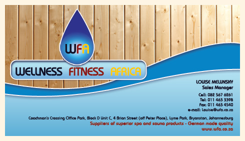
Their problem:
They had run out of cards, and anyway, the cards didn’t really say what they DID.
Their solution:
Slap the existing logo on the card with the appropriate wording:

So yes, I could do that for them at 300dpi, CMYK with a 4mm bleed. But I wasn’t going to.
If I’d done that, someone somewhere would have picked up that card and said “Who designed this?” and they would have said “Meryl from pixelmagic” and I would have lost a potential client right there. Not to mention how a reputation can spiral into the ground like that…
Designers do more than just put the logo on the business card
Designers are there to create the sizzle for you to sell.
This is a company that sells high end, high quality luxury spa and sauna products. So immediately, I knew the card had to portray a feeling of clean luxury. The logo was very dated, so I made some small changes to try to update it a bit, without losing the original feel: I used a slightly more modern font, I updated the bad 80s colours (while keeping a big nod to the colours of the German flag – the boss is German and proud of his heritage, and the products are German made) and I’ve added a lot of clean white “spa” lines, with a little bit of depth.
I wanted to bring what the company does out in the design and feel of the card, as well as the wording – so I added wood textures for the saunas, as well as including water shapes and colours.
My solution:

They loved it – it was exactly what they wanted 🙂